Case Studies


Typography Recommendations
Brand with Intent
Avoid fonts associated with Google and Apple, select typefaces that align with how we want people to perceive the Emerson brands
Follow Through
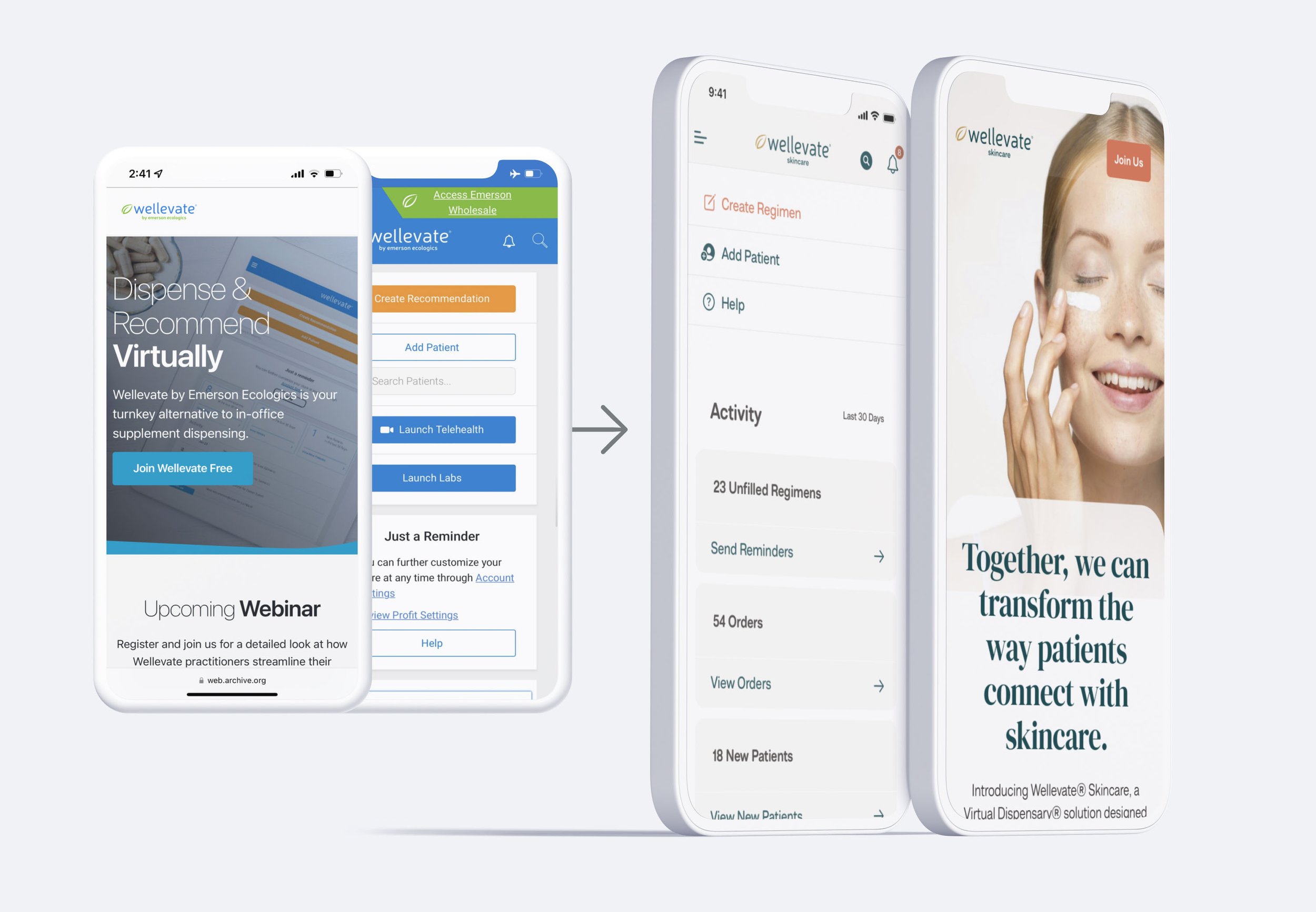
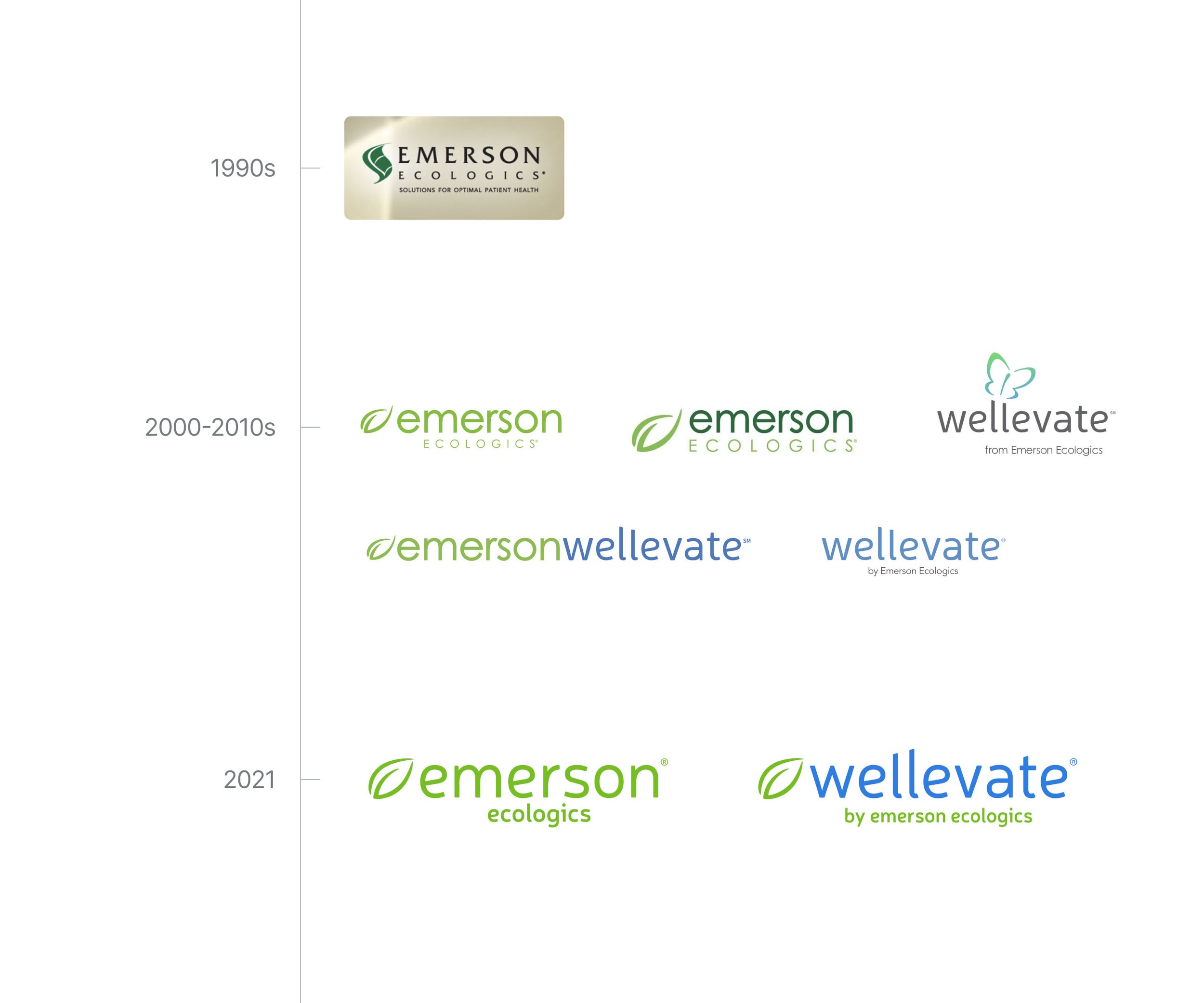
Build on the work already done for the 2021 logo iterations, apply to all customer touchpoints
Capitalize
Invest in typefaces and make use of the opportunity in fully-branded communications
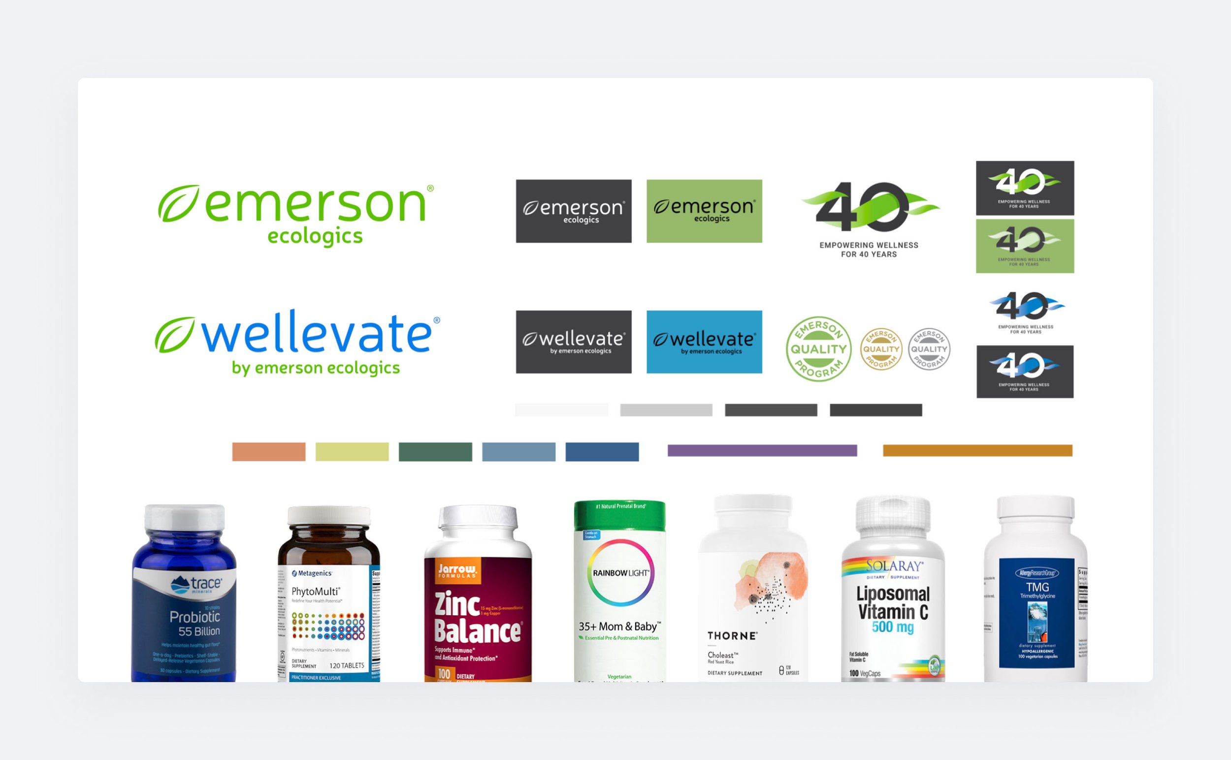
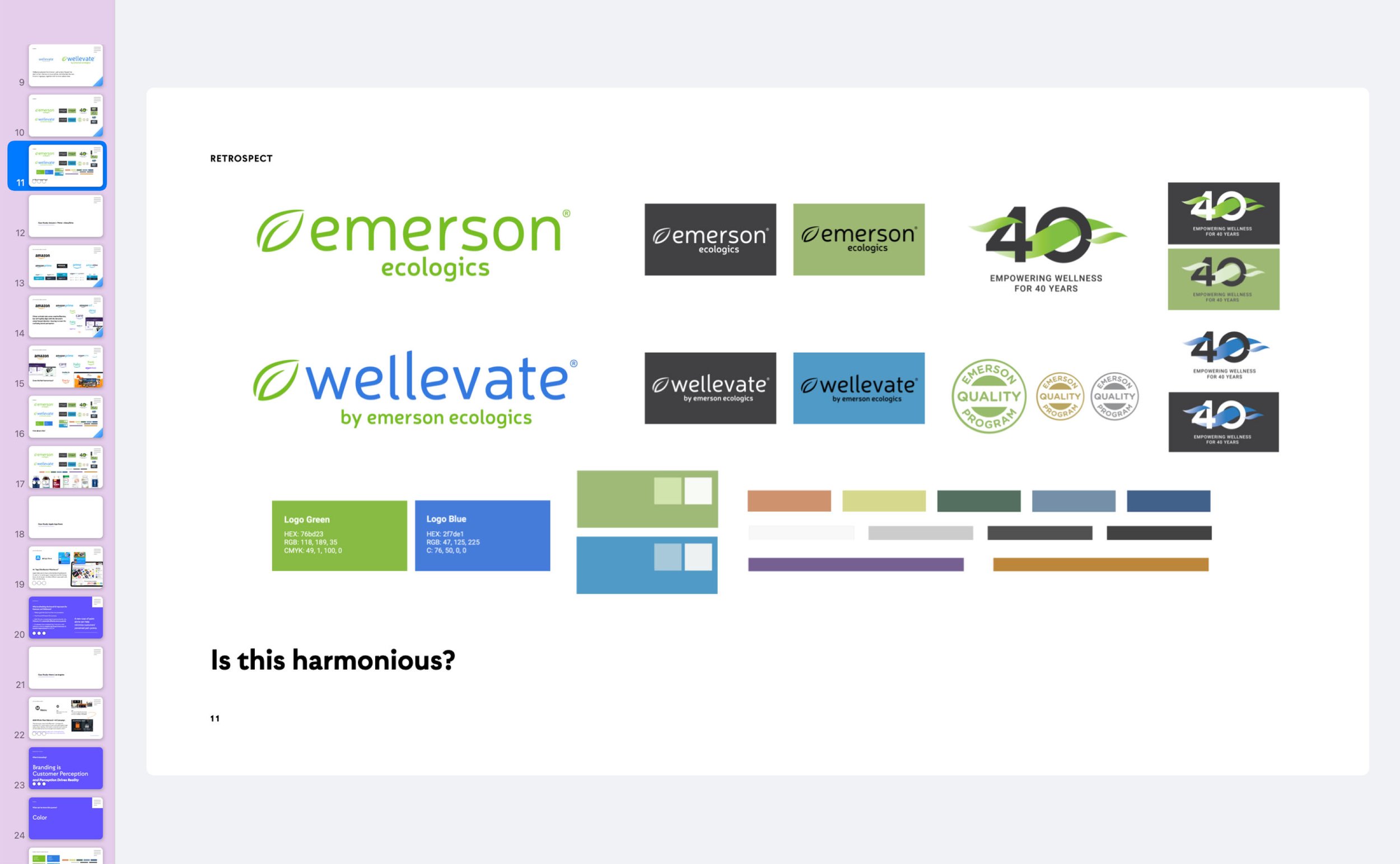
Color Recommendations
Simplify
Do more with less
Neutralize
Complementary values, tones, luminosities
Harmonize
All palettes must work in harmony
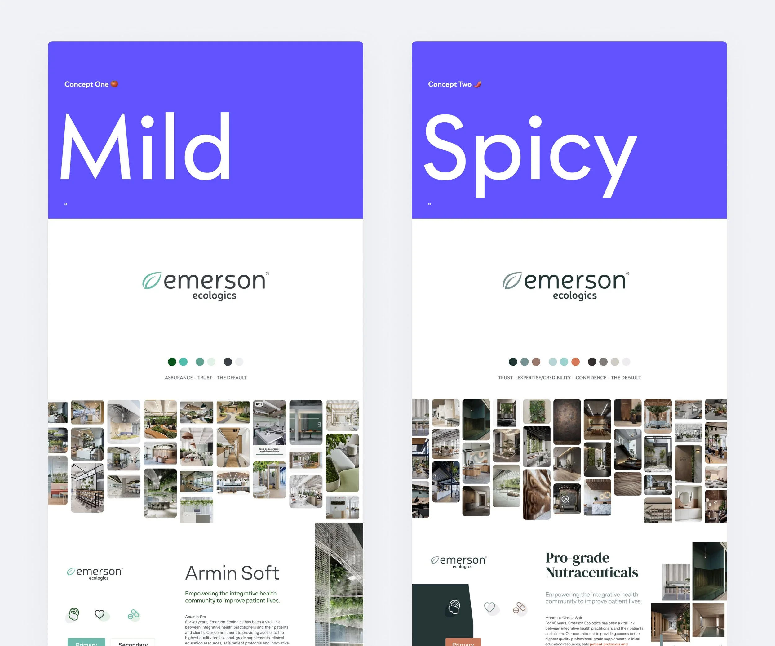
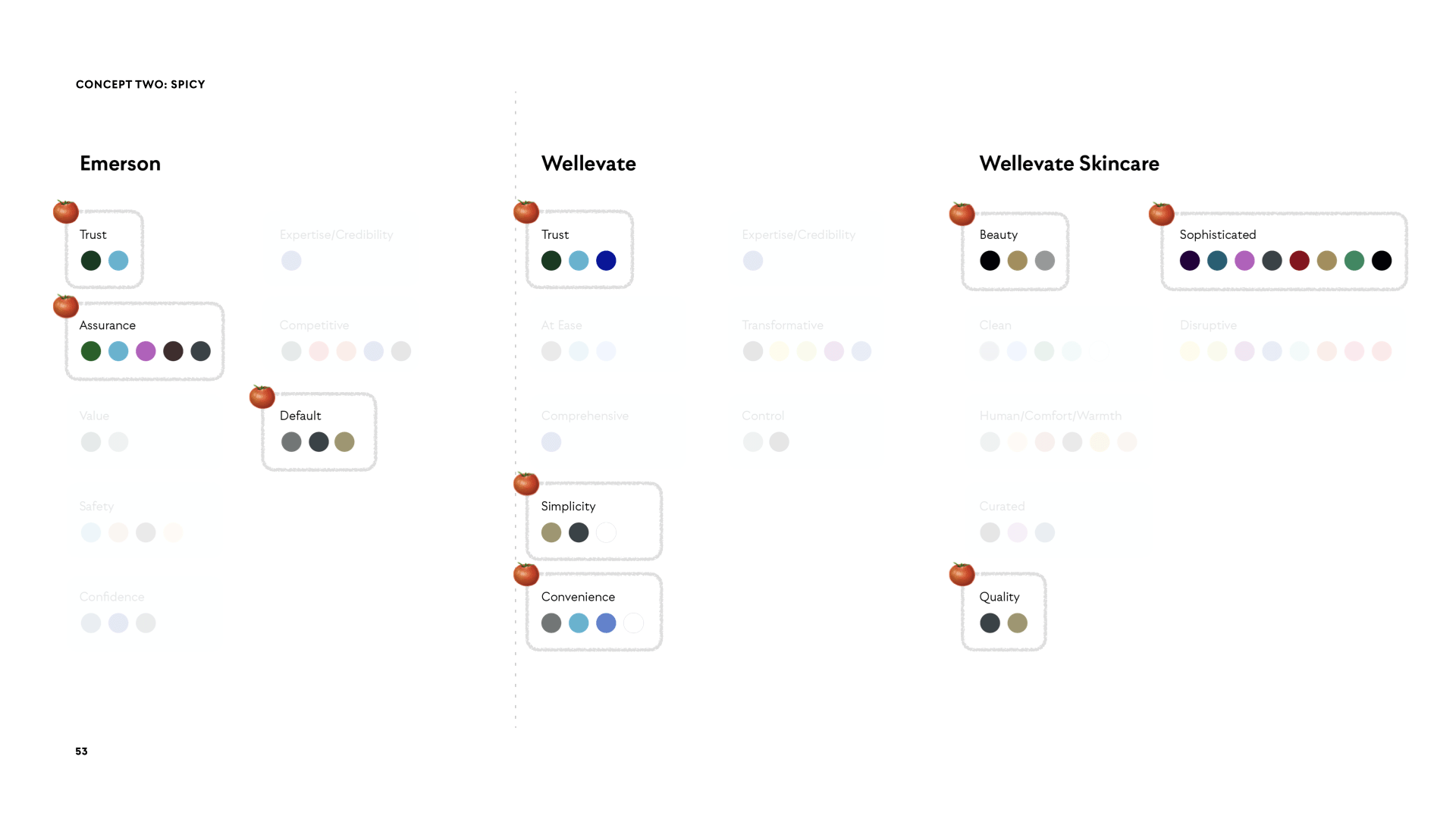
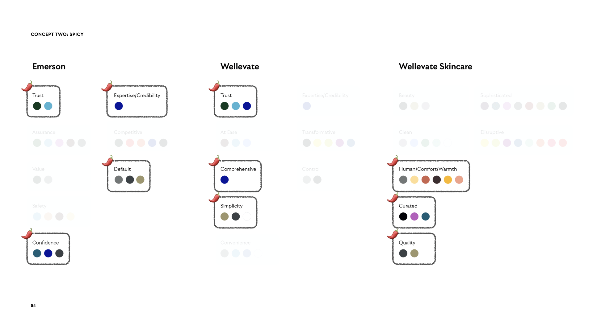
Mild vs Spicy Identity Concepts
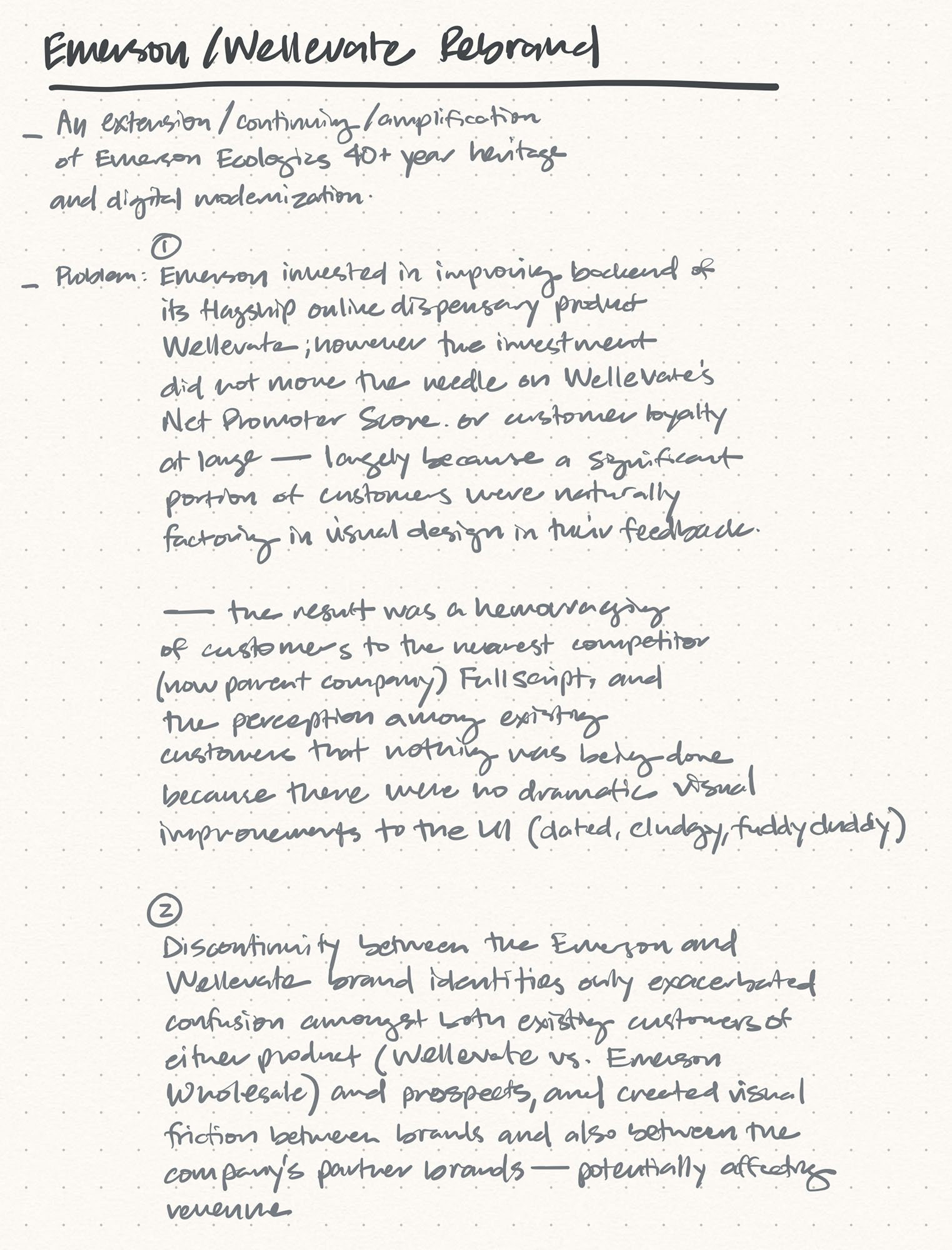
Over the course of about ten presentations to stakeholders including the Marketing, Product, Engineering and Medical teams, Exec. Creative Director, VP of Marketing, CMO and CEO, I provided two design directions.
The “Mild” direction was a safe choice that took a light approach to modernizing the various identity elements that were on the table. Type and color were designed to be intentionally familiar, relative to the status quo. A singular sans serif that nearly mirrored that used in the 2021 Emerson and Wellevate logotypes was leveraged. Muted earth tones were replaced with fewer, more radiant iterations of greens for Emerson and blues for Wellevate to align with attributes of trust, assurance, simplicity, and convenience. For Wellevate’s Skincare initiative, shades of purple were chosen for its alignment with sophistication, and asymmetry with the parent Wellevate’s blues.
While not necessarily radical, “Spicy” was the direction that most contrasted against the status quo. Trust, confidence, expertise, credibility, comprehensiveness, and simplicity all guided the creative choices of this direction for the Emerson and Wellevate brands. The 40+ year heritage of the whole company commanded a type of dignity and confidence conveyed through an elegant headline serif; a complementary modern sans serif that would also enhance UX across all digital product; and deeper hues of green and blue, coupled with both metallics and warm neutrals closer to brown rather than typical cool grays and blacks, alongside a moderately-radiant action color set matching that of plutonium. For Skincare, I emphasized more human qualities, comfort, warmth, and curation through its own palette.