UX / UI Product Design. Brand ID & Strategy.
emerson_wvDosageUX-02-finalProduct1@2x.jpg

Product UX, UI. Wellevate Dosage Interface

Wellevate is an online supplement dispensary platform by Emerson Ecologics, where healthcare practitioners (HCP) define custom treatment protocols for their patients, who can then purchase those recommended products directly. This project focuses on the Dosage Interface that HCPs use to provide instruction to their patients. It was an exercise in filtering various truths across disciplines, iterative design, and prioritization of myriad business goals.

Four Problems. One Resolution.

Lauded as one of Wellevate's defining features, the Dosage Interface was innovative in its space and allowed HCPs flexibility in specifying instructions for their patients. Though, over time more functions were added, in ways that added complexity without careful consideration of the whole experience. These layers of iteration allowed four problems to fester.


Process Notes, Wireframes, Ideation

These notes explore early design thinking for the Dosage Interface—distilling the UI using common and familiar UI patterns and exploring how such a complex interface could display across mobile, tablet and desktop while also minimizing disparities across those breakpoints to optimize UX and help shave level of effort for Engineering.

The notes also cover internal user feedback and insight from the various Medical Team members including standardization for fractional dosing (i.e. HCPs using fractions over decimals in their instructions to patients); how often integrative HCPs rely on manufacturer’s Suggested Use—unexpectedly not often; and the importance of providing HCPs all options that define whether any supplement be taken with/without food, before/during after meals and how those options may correlate with designated times of day to take them such as in the mornings or evenings, or before bed/after waking.

The Product Team took two hours out of the week to share our top five UX concerns with the Wellevate platform. At one session, I brought up the issue of unnecessarily descriptive microcopy on primary and secondary actions; the poor UX in the cryptic dosage instructions output [see blue circles indicating scoops/frequency/duration]; and the lack of manufacturer Suggested Use which HCPs could find invaluable when defining supplement protocols. The latter turned out to be a customer pain point that both the Medical Team and CEO later independently corroborated after reviewing my UX recommendations. These particular areas of friction later became baselines for requirements to be included in the Dosage Interface redesign.


User Interview Feedback, UI Landscape Analyses

The following notes covered new insights and affirmations of assumptions from the Medical Team, including the lead officer who had been with the company for decades. Top takeaways include 

  • the clarification of semantics as a “Suggested Use,” or “before meals” and “after meals” (and the correlation with “with/without food” as parameters),

  • suggested model EMR interfaces to cross-analyze,

  • clarification that fractions are standard in indicating fractional doses as opposed to decimals, and

  • affirmation of my recommendation that Suggested Use by the manufacturer be visible and not hidden behind the Product Detail tab, so HCPs have an upfront point of reference when defining protocols.


Ten Iterations Built with New Design Language

A Look at the Initial & Semifinal Rounds

Bird's Eye View of Iterations

Bird's Eye View of Iterations

It took ten iterations ranging from moderate revisions to near-total redesign to get to relative internal consensus on a new experience that leveraged the new design language of Emerson’s new brand identity, which I had also been charged with. Stakeholders from Product Management to Medical to Marketing to Engineering, all provided input that shaped my direction for the new Dosage Interface experience.

Inevitably, much like a concept vehicle, an MVP was designed that still integrated the most pertinent functional changes, while leveraging the legacy Material design language and framework. While expected, this new MVP was borne out of competing priorities and limited resource capacities between Marketing, Product and Engineering (see “An MVP to Test Functionality” above).

Version C: Distilling to Simplicity with Tradeoffs

Version C: Distilling to Simplicity with Tradeoffs

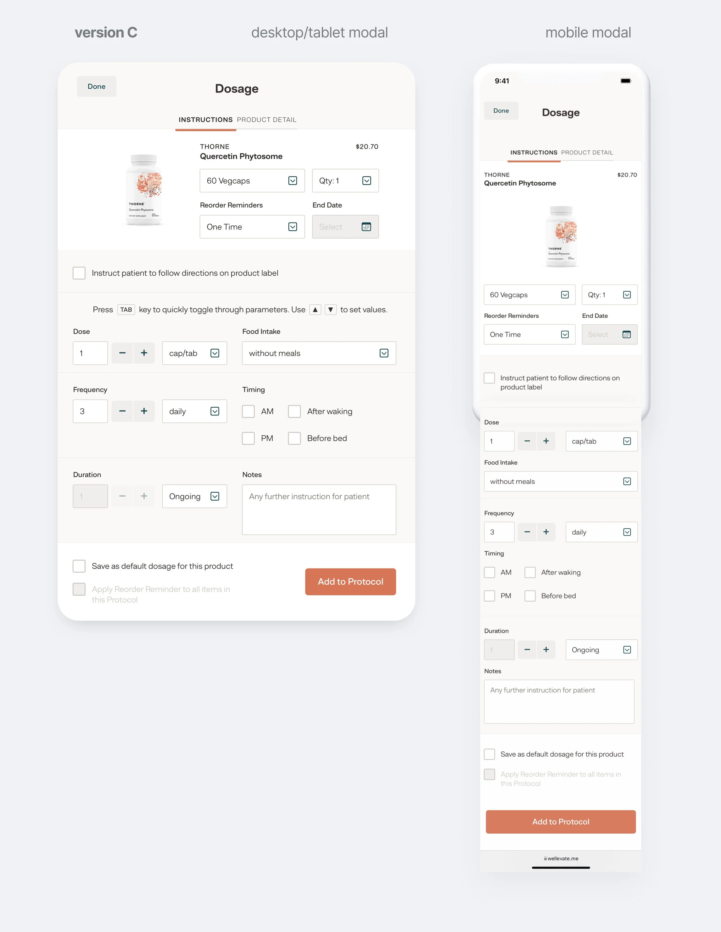
This initial version was a blend of light internal input and design thinking leveraging common UI patterns to align with Jakob’s Law—users preferring familiar patterns across disparate sites and applications to achieve their microgoals. The result was a less-noisy interface that

• swapped disorienting hybrid toggle-buttons with standard selection menus or checkboxes dependent on the functional context;

• eliminated controls that overrode the other without appropriate visual cues indicating as much;

• introduced the Product Detail tab into the Modal to bring parity between it and the near-identical Drawer view;

• consolidated controls for Reorder Reminders;

• dabbled in a keyboard shortcut scheme that theoretically could have added value for power users;

• increased affordance, and tweaked the microcopy of the primary call-to-action to eliminate confusion over users’ final action;

• and added an “Instruct patient to follow directions on product label” checkbox as a simple-to-implement stopgap intended to reduce friction for HCPs wanting a quick, one-click method to provide instructions to patients.

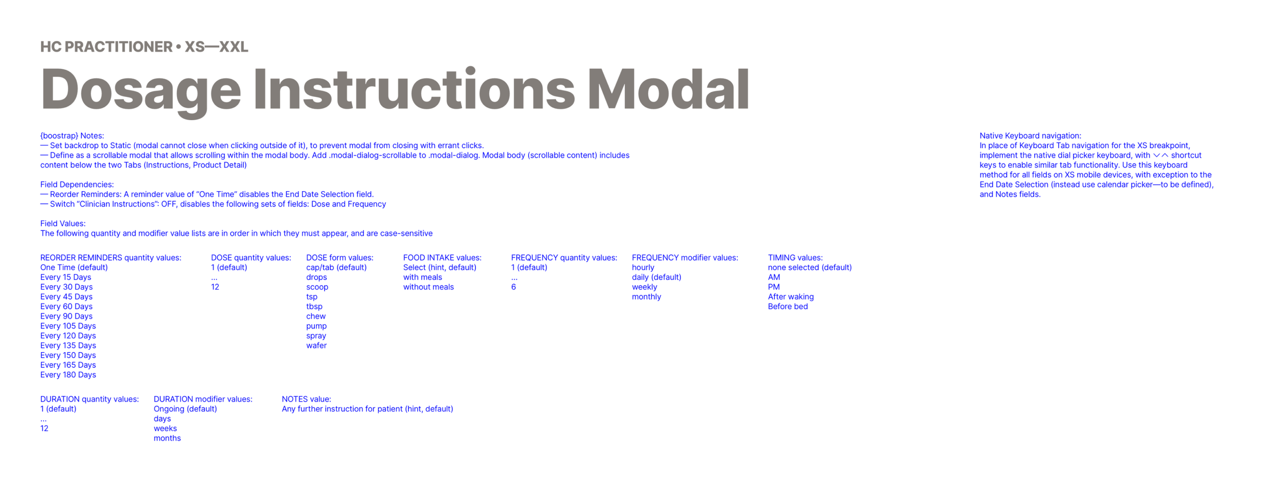
UX Annotations for Engineering

UX Annotations for Engineering

Engineers find written annotations from designers to be particularly helpful if only static mockups are provided, on top of guided facetime walkthroughs.

Version G: Return of Presets, A Miss on Range & Fractionals, and the Sidebar

Version G: Return of Presets, A Miss on Range & Fractionals, and the Sidebar

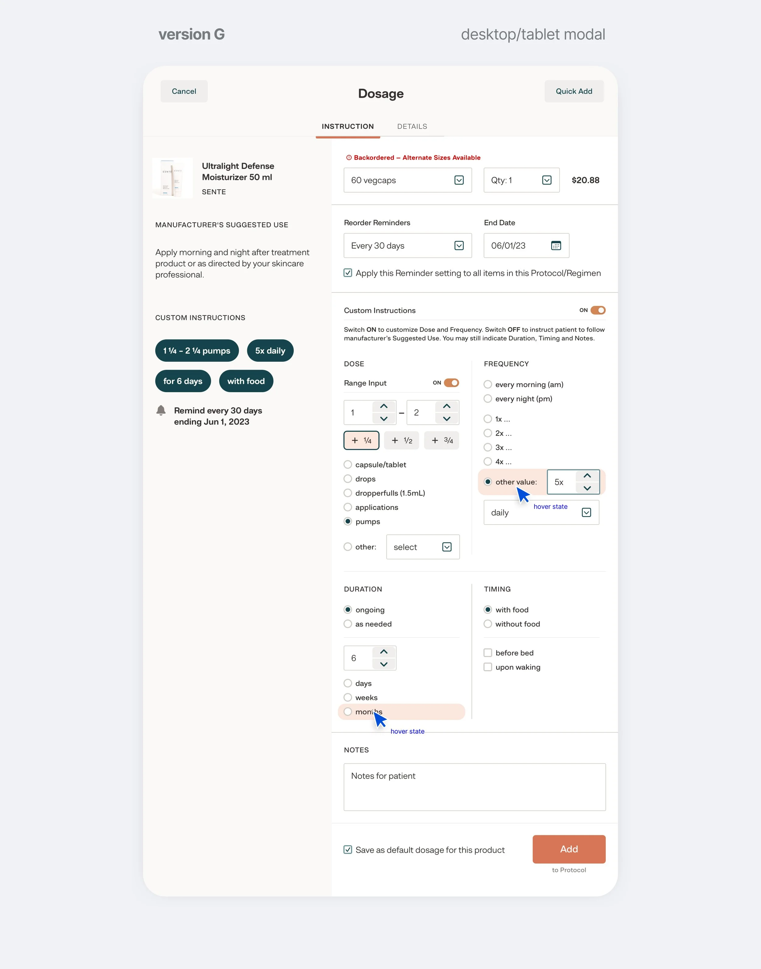
This semi-final version is reflective of a set of major revisions that considered internal feedback around the need for the manufacturer’s Suggested Use as an upfront point of reference, and maintaining all existing functions while also considering a solution that lined up with Jakob’s Law and Hick’s Law—less complexity and choices lead to less time for users to make a decision.

Initial versions like Version C prior, opted for consolidation of controls into selection menus and checkbox lists. This was a gambit for a cleaner, less overwhelming UI at the expense of more clicks/taps required of the user. The Lead Medical Officer later emphasized her desire to not change the design too much, recommending to pare back some changes. I agreed, given the volume of product that each healthcare practitioner needed to customize for each patient and to minimize potential blowback from veteran users acclimated to the legacy UI.

Version G reintroduced commonly used preset options from the legacy interface, but as more familiar UI patterns (Jakob’s Law). This did have the side-effect of reintroducing complexity to the interface, which remained a concern of stakeholders from myself to the Chief Marketing Officer who wished to leverage a more streamlined Dosage Interface as a marketing tool. Fortunately, one insight into a segment of integrative healthcare practitioners revealed some only use the Notes section—allowing me to group and effectively hide all these controls with a switch control. This turned out to be a happy compromise addressing all stakeholders’ concerns in

• maintaining flexibility for acclimated and power users,

• minimizing complexity not just for users that exclusively used the Notes section but for all users whenever it would be appropriate for each unique case and external circumstances,

• and improve the UX with the intent of affecting positive net adoption of the platform to fulfill business OKRs.

Another pertinent element here was the inclusion of fractional and range dosing. My first design approach was rather kludgy—two numeric fields, plus three toggles per quarter-dose, all enabled by a switch. The thinking behind that was to enable the platform to parse the inputs and have the flexibility to manipulate it elsewhere (e.g. comparing the delta in measurements if a practitioner were to revise dosing for a particular patient). However, the simpler UX of a single open text field was determined to outweigh the potential benefits of that use case.

Lastly, the sidebar was introduced to provide top-level information about the product and manufacturer’s Suggested Use as a point of reference—resolving a persistent customer pain point of flying blind, and providing tags that summarize in real-time all dosing parameters the practitioner defined, to reduce cognitive load in reviewing one’s inputs.

Version J: Refinement

Version J: Refinement

This final version was a refinement of Version G above and coalescing of several iterations, fewer do-overs, and learned insights through internal user feedback, and focused on

• simplifying the Dose section into an open text field with a limited character set

• allowing for manual entry of fractions and ranges with simple text, and reorganizing the layouts of Frequency and Duration parameters

• a clearer, more intentional approach to leveraging switch controls to enable/disable Reorder Reminders and Custom Instructions (the grouping of advanced dosing controls).