
Brand ID, App UX/UI, Marketing Site. Real Time Trivia
App design, brand ID development, marketing site concept

Real Time Trivia
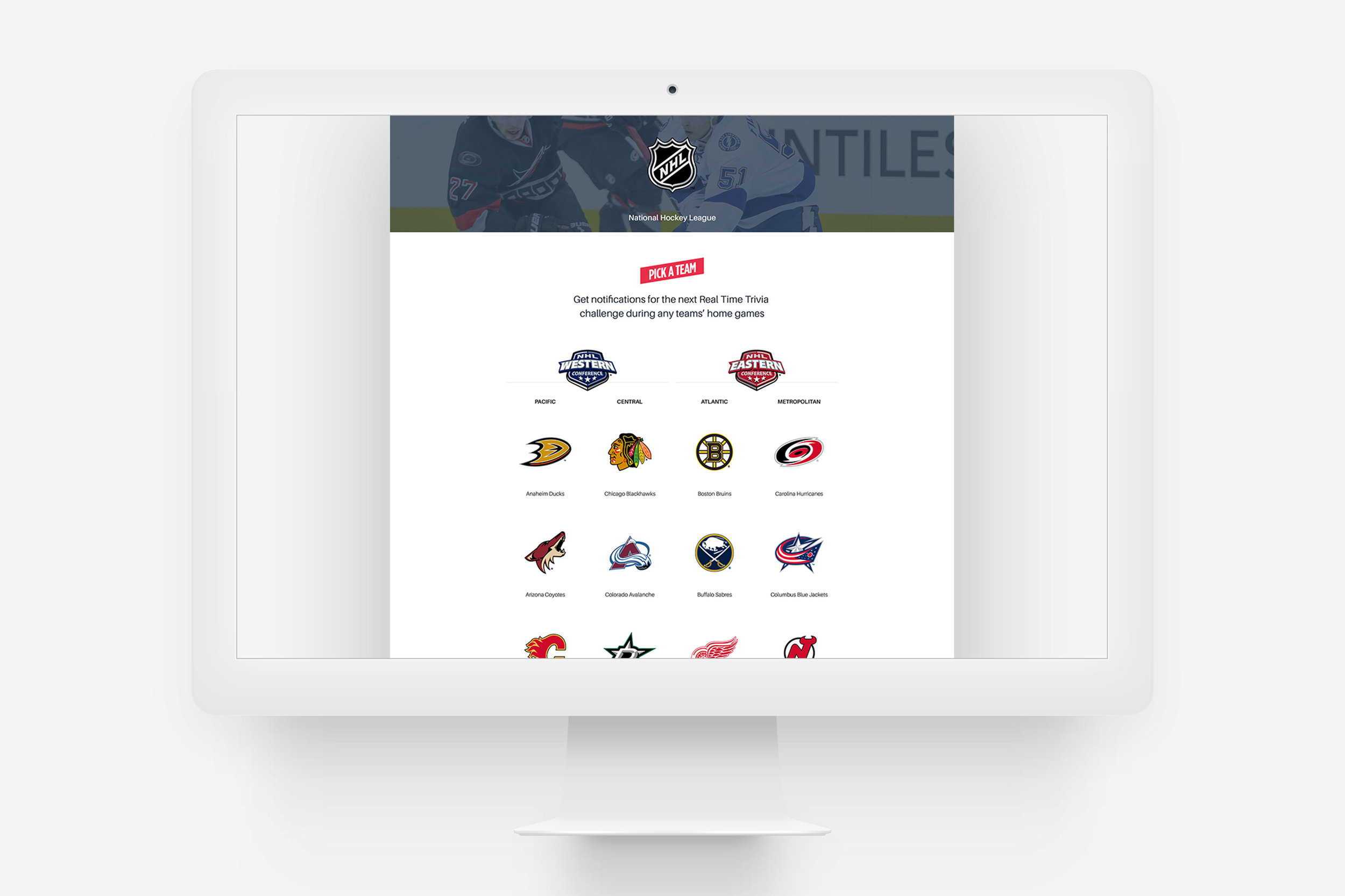
RTT was a build-from-scratch opportunity. The client needed to execute on an app idea, requiring an agnostic app prototype, a brand to give it a public- and investor-facing identity, a marketing website prototype for the product itself, and a separate site for partners and investors to reference.

Logomark Concepts
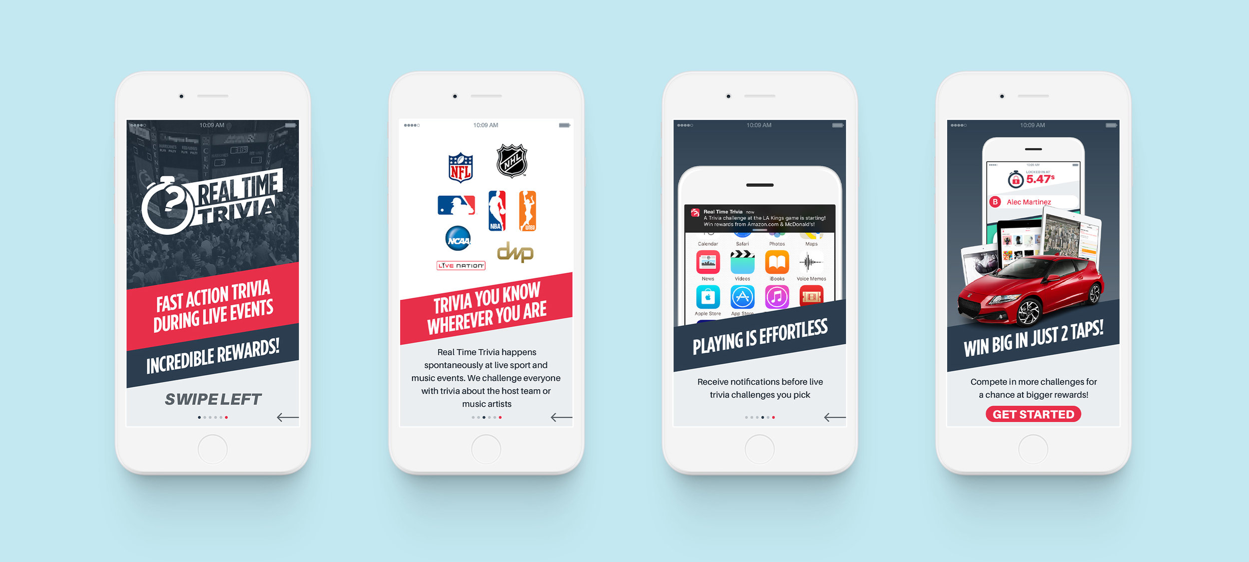
RTT’s brand needed to meet several criteria. It needed to match the energy of the environments it would appear; galvanizing large crowds to take a simultaneous action while they experienced a boisterous and immersive disruption.


Identity System
The brand identity needed to be bold and loud, yet flexible enough to provide visual space to many diverse and contrasting consumer brands.
Minimalist dynamism was what we were shooting for.
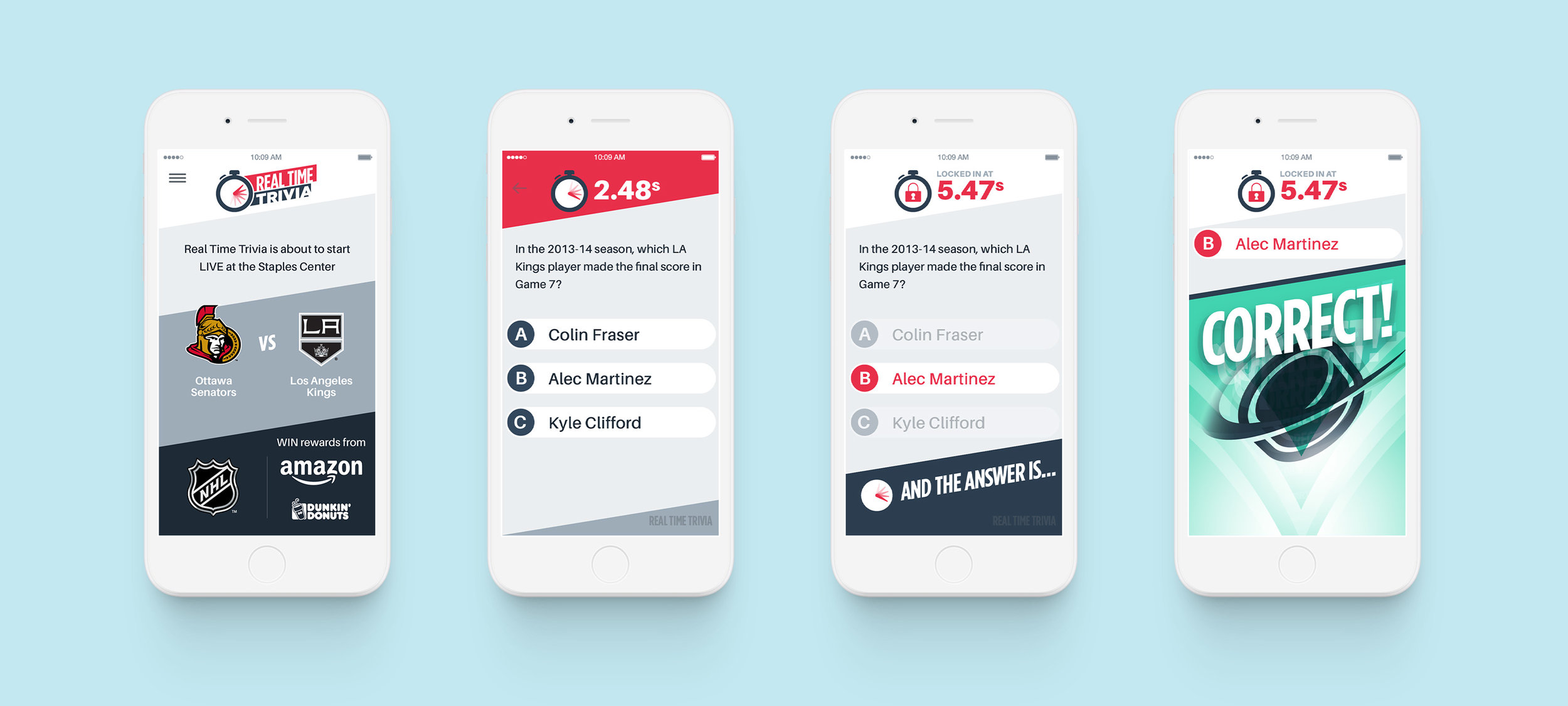
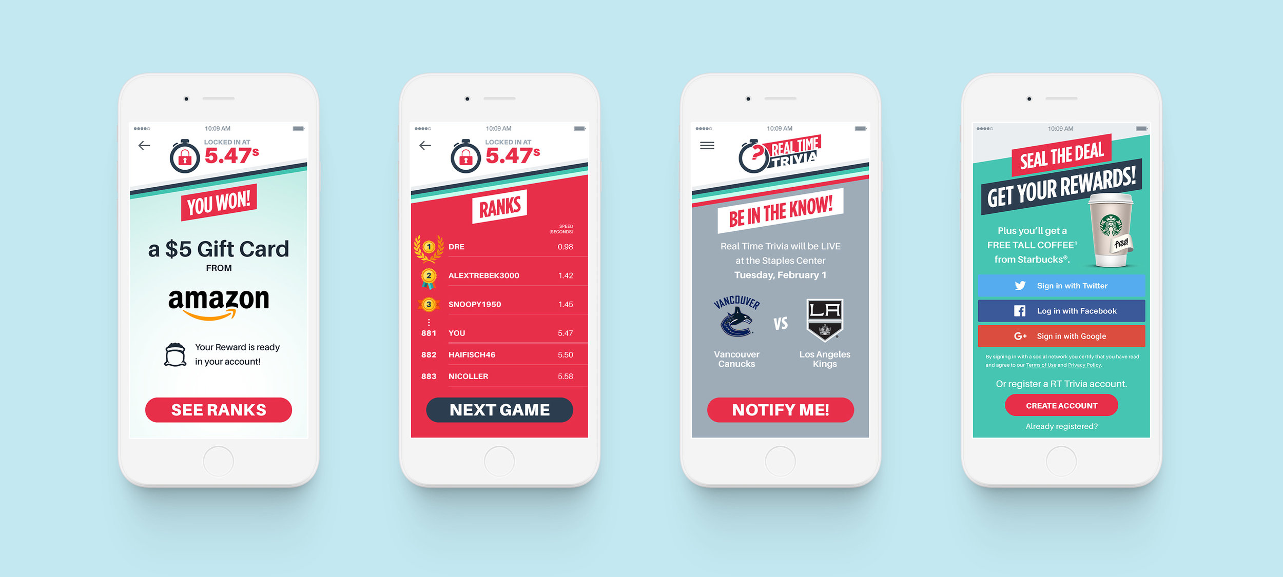
In-Game Userflow
Admittedly, it was not an easy task, and in hindsight there were some missed opportunities, and while “minimalism” was a goal, we fell short on that aspect as a means to achieve other ends.
The brand, and UI at that, could have been more subdued to let the content breathe, and the user focus on the very pressing task at hand of answering trivia questions with only seconds to spare.
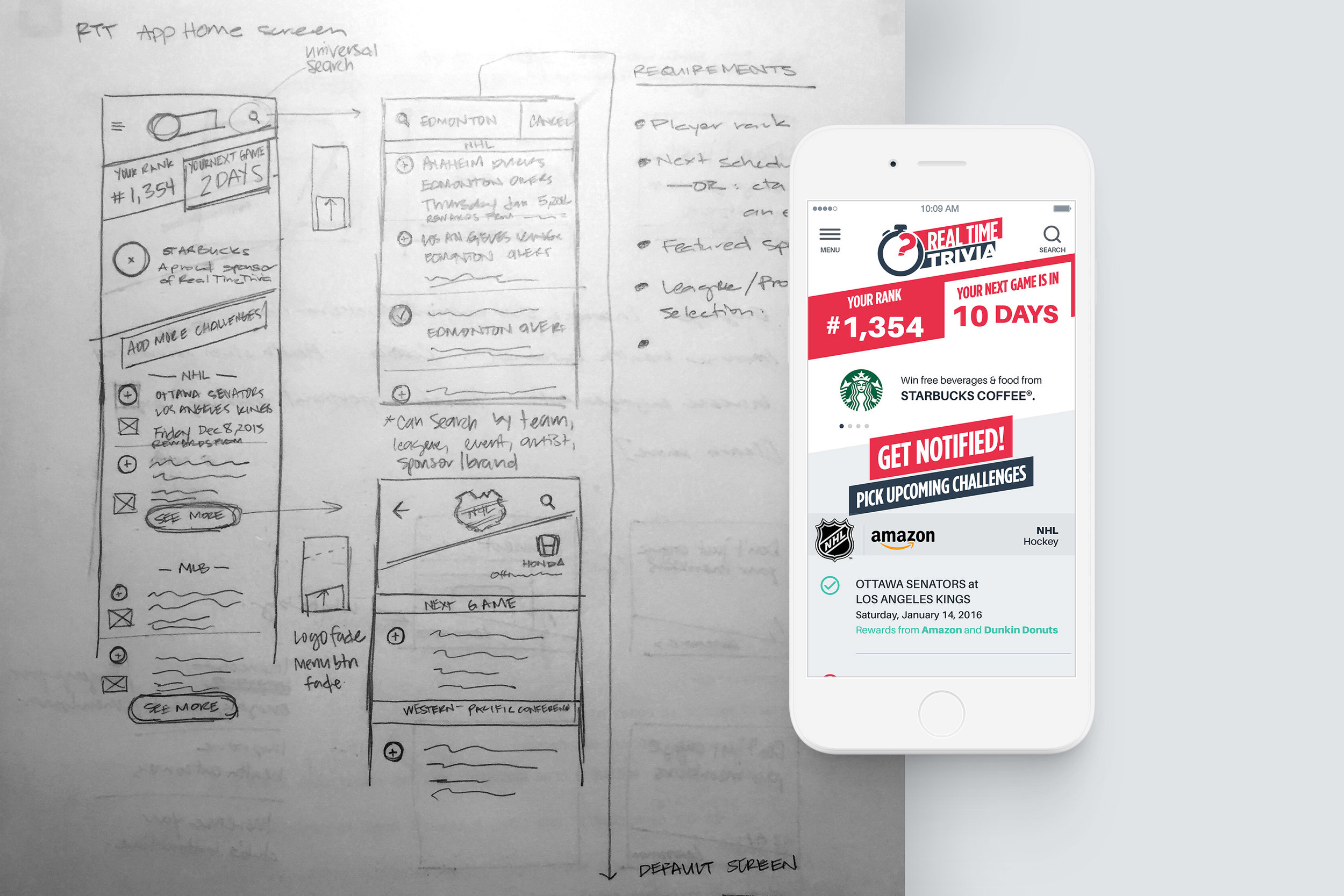
Home, Search & Detail Screens
The client wanted the home screen to showcase some key selling points, above the ‘fold,’ to clearly illustrate the app’s feature set outside of gameplay—leaderboards, challenge schedule and push notification functionality, ad space for partner brands and their reward sponsors.
It was a lot of functionality to pack in a mobile experience, while creating a unique game-centric UI.

Success
With that said, the goal line at that stage of RTT’s business was to create a minimal viable concept—not a polished product. And what we produced fulfilled the client’s goals of capturing buy-in from executives of several high-profile entertainment companies and top division, national sports leagues.
