


Brand ID and guidelines
The brand for h2 wellness, a SaaS company, had seen a handful of iterations before my tenure. When I joined the team, the iPhone and App Store ecosystem were in their prime, and many brands co-opted Apple’s primitive, a square with rounded corners. Before that iteration, it was a pair of oranges with green logotype (if you could call it a logotype), which got plenty of laughs in the office whenever it resurfaced.
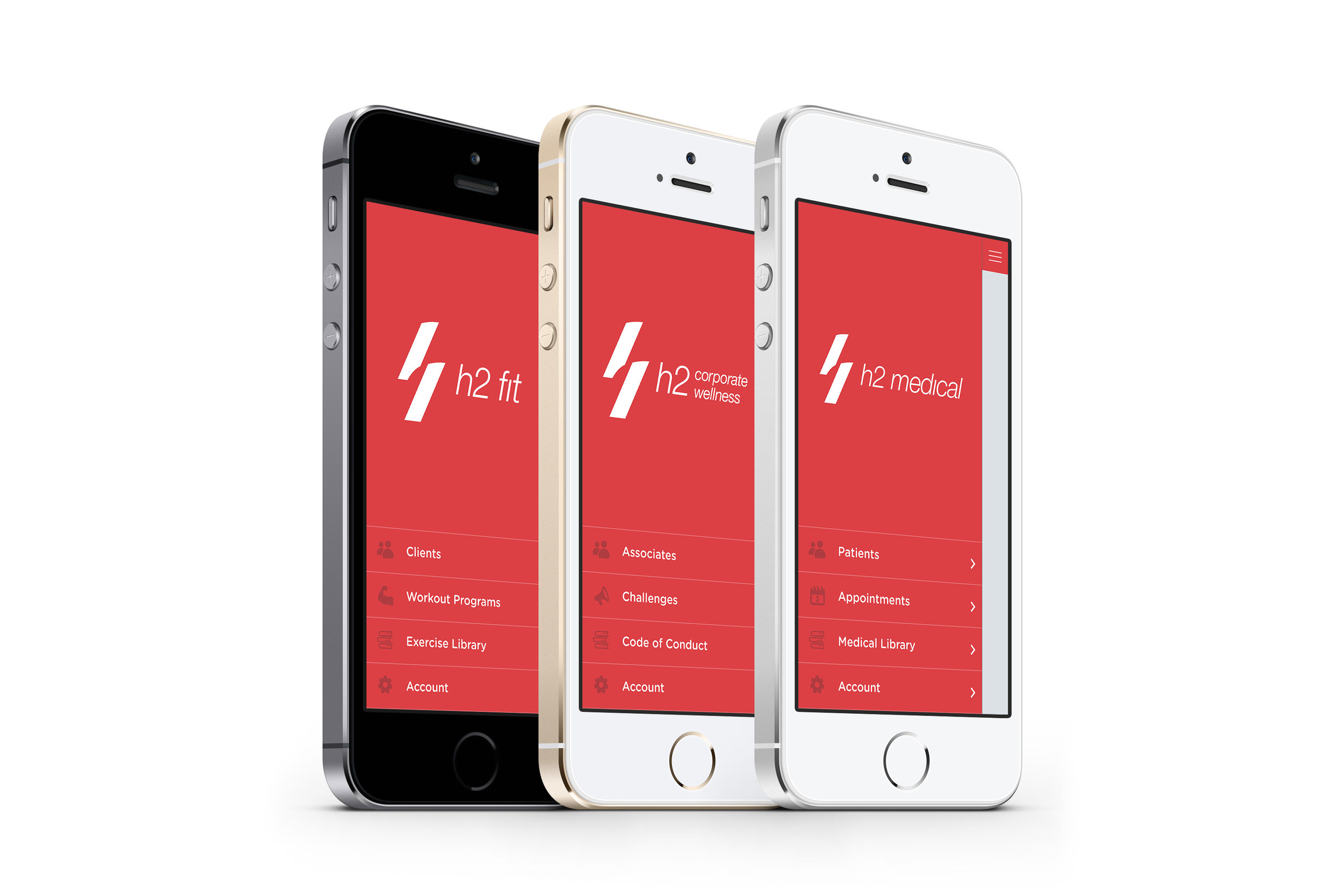
After creating a small-scale identity system for the “App” mark—introducing modular logotypes that could be swapped out for different verticals and/or departments, we chose to move in a new direction that reflected less trend-of-the-day and more of the company’s expanding reach into the rapidly evolving health, wellness and technology space.
Working with fellow designer, Melissa Foliente, we went through the rounds of finding a new mark that would succinctly capture the foundation of h2 wellness, the forward progression of the company’s goals and industry influence, and the human relationships that h2 sought to forge through its software solutions.
h2’s namesake since its inception was symbolic of the founders Hooman Fakki & Houman Arasteh—two friends joined at the hip since childhood. Clients recognized h2 as Hooman & Houman and vice versa, so maintaining that relationship through a new mark was important to all stakeholders and the image of the business itself.
The company’s pivot toward providing modern solutions to the medical profession was a factor in our decision making. We needed to express a refined level of precision and reliability in our solutions. With the revolution in connected health just beginning at the time, a sense of agility and nimbleness rose to the top of our requirements for brand expression.
And with that pivot, h2 was in the midst of creating new dual, human relationships: customer–entity; patient–physician or educator; client–trainer.
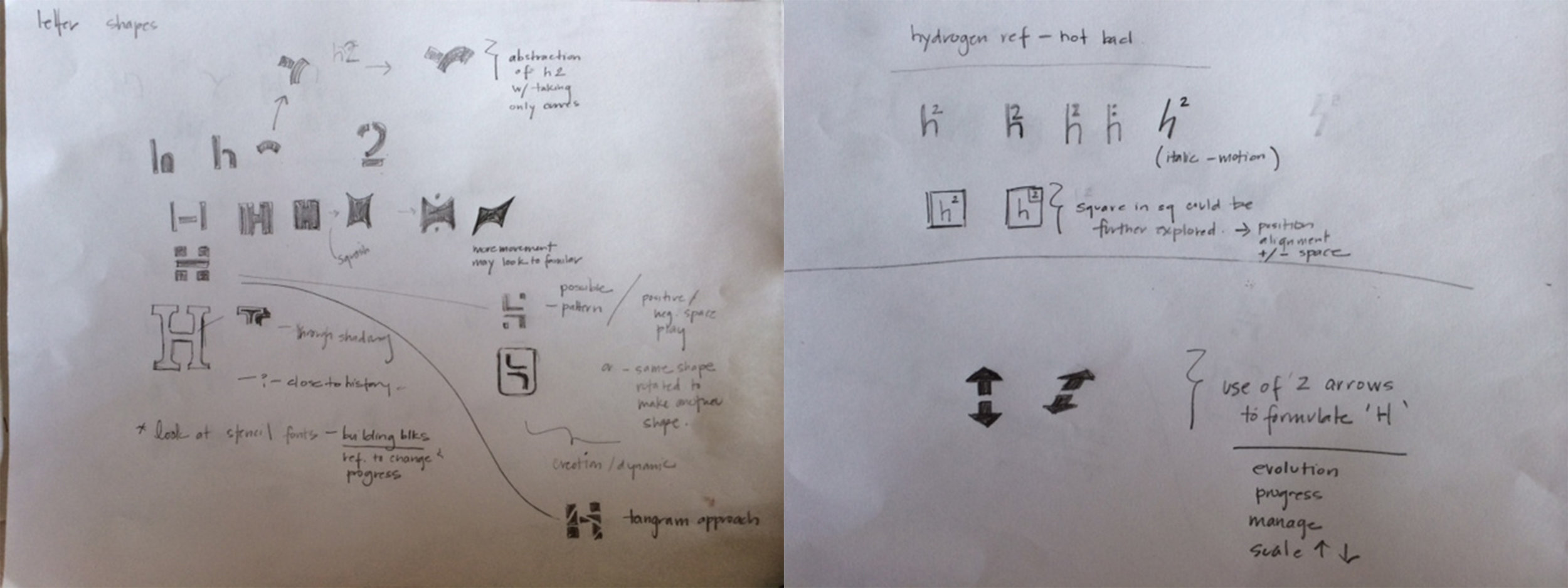
Duality became a prominent focus for us. The founders, and more importantly human relationships.
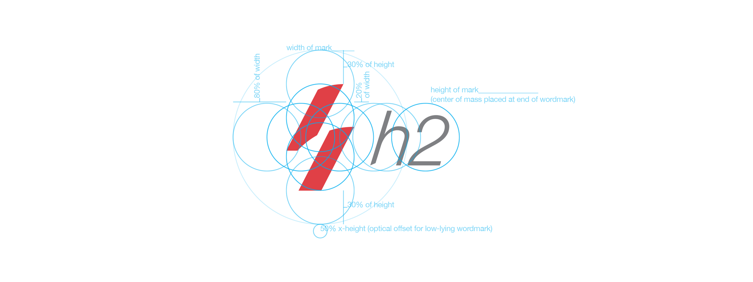
Our design thinking eventually distilled itself into returning to a lower-case “h.” This represented the founders, Hooman & Houman. This represented humans—the lowercase letterform lending itself to be more approachable, natural and elegant than the austerity of the capital “H.” Extracting and skewing the ascender, shoulder and secondary stem of the lowercase form evoked forward motion in an abstraction that cleverly captured our top criteria.
The two pillars of the abstraction rose the challenge of a progressive vision for connected health uniquely offered by h2 wellness.
Other characteristics we wanted to convey in the visual ID was modernity, simplicity and reliability. These were and continue to be principles to adhere to in the connected health space—customers expect it and regulations demand it. As a type family, Helvetica Neue felt like a square peg fitting nicely into a… square hole. I would be withholding information if I didn’t say that Helvetica Neue was have a renaissance of sorts within design circles at the time, so I don’t doubt that was also a factor in our decision-making, conscious or otherwise.
Building on our focus for human-centered relationships, we chose to follow through on this sense of approachability, branding the formal company name and its verticals with lowercase letterforms. A strategy echoed by others like adidas, jetBlue and smart.
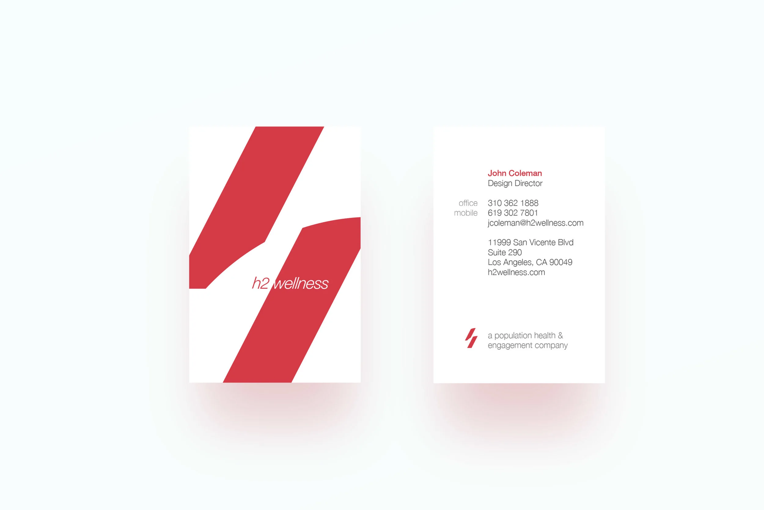
Yes, the deep hue of the h2 red looks like blood.
That was deliberate. h2 is a health & wellness company and embracing the color of lifeblood was important—not something to shy away from. Also important was our intent to distinguish ourselves amongst other same-industry players that chose the cooler end of the spectrum, which nearly always reflects as corporate and impersonal. A core principle of h2 was to enact behavior change through action, and we wished to express that with the bold energy that comes with the warm end of the color spectrum.